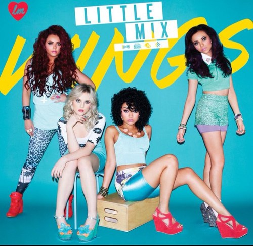
Typeography-
The title of the album and the name of the band are layered across the front of the digipak, making the album cover look lively and upbeat. This appeals to their younger target audience because it connotes a sense of joviality and carefree nature. This fits the genre of pop because it is lively and positive in its outcome, much like many pop songs. The name of the album is ‘Wings’. This in itself is a very positive word and connotes the idea of being lightweight and free. This overpowering positive nature is relevant to pop culture. The fact that the name of the album cover is layered behind the image of the band connotes a sense of glorification for the artist. The typeface (for the title) looks like it has been written in a large marker pen. This connotes vandalism and a small hint of rebellion. It is important that Little Mix do not only appeal to a certain type of audience, being the young and 'proper' fans. They must also add a touch of firey nature to their album cover, so as to appeal to an older audience also.
Mise En Scene-
The girls are dressed in tight and revealing clothing. They are all wearing bright coloured wedge heeled shoes. This will attract the attention of boys and the admiration of girls, widening their target audience.The matching colours of the bands clothing makes them look very clique-y and mainstream, focusing on presenting the music genre of mainstream pop. it is also noticable that the girls who are sitting down are placed on nothing but a plain metal stool and a woodne box. This connotes the fact that Little Mix are down to earth. This is an important aspect of the main image because of LIttle Mix's past. we know that they have 'come from nothing' because they became famous through a television contest. Their fans are likely to want the band to stay humble and appricative, and that is why they have not been photographed sitting in thrones and anything over the top.
Colour Scheme-
The bright colour scheme represents nostagia and has a very 80's tone about it. The colour psychology of yellow is uplifting and illuminating, offering hope, happiness, cheerfulness and fun. This is relevant to their techno pop music style. Light blue symbolises tranquillity which is shown through Little Mix’s upbeat and positive music and lyrics. The bold reddish pink is what stands out the most because there are only tiny bits of it. This may be used to connote the idea that Little Mix's album contains moments of boldness and rebellion. This is used to add an edge to the band and give them the potential to be more popular to a older audience,who are more attracted to a rebellious and individualised lifesyle.
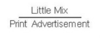
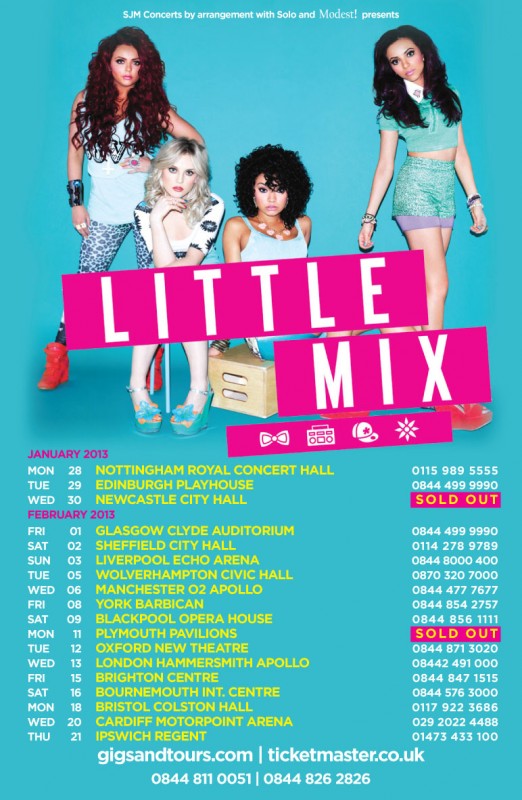
The recognisable image from their most recent album cover denotes their popularity. The colour scheme matches and makes the print out look bright and bold. The soft blue background mirrors the layout of the album cover making it recognisable to fans and the yellow text stands out as bold and bright and attracts attention. The logos underneath the title on the print advert represent the individual identity of each band member. Using simplistic symbols to define each one of the girls means that anyone who sees it, regardless of language or culture, can relate to it and find a similarity between themselves and the band. The lack of of image in the background connotes a timeless and placeless quality to the print ad which stops the band seeming outdated or selective of their audience. This is because there is not a set location on the print ad.
The sans serif typeface that has been used makes the band look current and fun as apposed to the traditional styling of a serif font. The fact that the list of tour dates is the same size as the main image connotes the fact that Little Mix see their fans as 'just as important as the band themselves' because it seems as though the needs of the fans have been put first. We can see this also by the boldness and size of the link to ticket websites. This gives the fans a sense that Little Mix are being as helpful as possible in the process of purchasing tour tickets because they have made the website addresses so large and clear.
The bold block colour that has been used to cover up the dates that are sold out connotes the fact that the band are popular and time is running. This would increase their ticket sales as fans would be more paniked and desperate to buy from the band, due to fear of not getting any tickets at all. We know that the pink colour is supposed to be bold and have an immediate impact on the audience because of the overall colour scheme. The colour scheme is simply simply primary colours, but using pink instead of red. The use of substituting red for pink not only adds a touch of feminism to appeal to the larger part of their fanbase, it makes the name of the band and the SOLD OUT blocks look powerful and dominant.
The band members all stand at different levels, in different poses. We can see clearly the face of each artist. This would appeal to the fans of Little Mix because the tone of the image is open and doesn't hide anything about the members of the band or the message of their music. This is not an abstract print advertisement image, and does not require any further thought or interpretation than you would receive after a quick glance at the ad. This could possibly be because Little Mix is based at a younger audience, who may not be able to fully understand any historical or cultural references in some more indie print ad images. Also, the genre of pop usually glorifies their artist in a very 'celebrity' manner. This means that by having a simple image of the band on the front of the print ad could generate more intrigue than a more abstract image. This is supported by the fact that the bands name, which is also their recognizable logo, is stamped on what appears to be the 'closest depth of field' of the print ad, glorifying the bands identity before anything else.