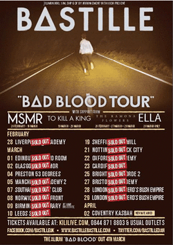
Print Advert - This is a print advertisement for Bastille's Bad Blood tour dates. As you can see, at the top of the page, the band has decided to place their band name here as this is what their fans recognised them from and therefore it needs to be bold and stand out amongst everything else on the page to attract their target audience. Again, instead of using the letter ‘A’, the band has used a triangle as this is what they are widely recognised for. The triangle could have also been used to represent the Illuminati or it has been rumored for connoting the triangle of reference which is also known as the triangle of meaning. (A model for how symbols relate to the objects they represent)
At the bottom of the main image which takes up just over a quarter of the page, a sub title has been used which reads “Bad Blood Tour”. This has been written in capital white sans serif lettering. Bastille tend to use the same typography across all of their products which may be a form of their brand identity.
The lines that are used in between the text could represent the edges of the road in the main image and maybe highlighting being very close to the edge of wanting tickets to see the band.
The main image that has been used is the same one which the band has used on their album cover and single cover of 'Pompeii'. This is a long shot taken of the lead singer trying to run away from the zombie apocalypse. We can’t actually clearly identify who the person is in the image but because the audience will have seen the album cover and the music videos, the brand identity makes it very clear as to who the person is. The image has been edited so that it is in sepia. The effect of doing this is that it gives the poster a sort of old fashioned look and makes the white text on top of it stand out clearly and will therefore attract the audience into looking. The image has been taken on a main road clearly at night, this almost gives across the idea of danger and that the singer may not be aware of the actions that could occur. The road also appears to be 'never ending' and this could illustrate that he is trying to run away from the black eye contagion and zombies but isn't actually getting very far. This very cleverly links in with the album name ‘Bad Blood’. However, the background surroundings have been blurred out showing the audience that this isn't the main focus of the image. The producer doesn't want us to look at what might be going on around the man, they just want us to focus on him only.
At the bottom of the poster, social media websites such as Facebook and Twitter have been displayed in a dull yellow sans serif bold font. This has been put on the poster to display to fans that they can visit these websites to find out more about the tour dates and bands. This advertises their brand name. The poster also has the album name on it and the release date as again this is a form of advertising to their fans.
The whole print advertisement consists of yellow and white colours apart from one part which is the ‘sold out’ signs, these have been made red and white to stand out on the poster and show the audience that these dates are sold out. Again, this colour could be a representation of danger and fear that the star is currently suffering. Across all three of Bastille's products that I have analysed, they all seem to use an extremely dull colour palette which I find very unusual, because these colours don't attract the eye straight away. I would be more drawn to a brightly coloured print advertisement than something that is dull looking and boring.