
How EFFECTIVE is the combination of your main product and ancillary texts?
Below is a transcript of the Prezi.
Location
One location that we used heavily was the London City skyline. This was used in our music video, on our print advertisement and finally, on our digipak. The reason that we have decided to use this across all three of our products is because we want our target audience to understand that our main star and the main actor seen in our narrative are performing at two different times and are therefore not the same people. The skyline is first seen in our music video when our main star is singing at night and then seen again on our digipak back cover and print advertisement. However, here we see it in broad daylight enabling us to establish the two different time zones. When the main actor is green, the sky line is shown in daylight and when our main star is dressed normally, the city skyline is in the dark.
One location that we used heavily was the London City skyline. This was used in our music video, on our print advertisement and finally, on our digipak. The reason that we have decided to use this across all three of our products is because we want our target audience to understand that our main star and the main actor seen in our narrative are performing at two different times and are therefore not the same people. The skyline is first seen in our music video when our main star is singing at night and then seen again on our digipak back cover and print advertisement. However, here we see it in broad daylight enabling us to establish the two different time zones. When the main actor is green, the sky line is shown in daylight and when our main star is dressed normally, the city skyline is in the dark.
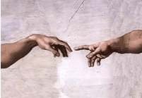
Theme/Narrative
We adopted the idea of this image originally because it portrayed the idea of having two halves, your hopes and dreams and the person you want to be, and this works parallel to your actual identity. However, the religious history of this image means it is also symbolic of the perfectionist society that also stars in our music video, as Christianity is a very widely worshipped religion, with very specific ideas, much like the society in the world our protagonist lives in.
The actual image links into the motif of ‘the hand’ that reappears throughout the video. The extreme close up of the hands of our protagonist worked because you can see how hard he attempts to fit in to the society he lives in by his constant grasping. He grasps onto books in the library in an attempt to learn how to fit in and he grasps on to flowers in an attempt for a friendship. We also focus on the zombie attempting to wave at the people who are running away from him in fear. His hand movements serve to show our audience how hard he tries to find acceptance. This is why we thought that the image of his hand would be an important and appropriate image to replicate across all of our products as our brand identity.
We chose to signify this in a new and unique way on our print ad by having an image of our zombie facing away from the camera to highlight his isolation and then we took an image of a city skyline that represents the unaccepting society, and layered it over his hands. In this way, we are still replicating the idea of the zombie’s hands being tools that he uses to include himself in society but we also convey the idea that society does not want him.
“Our dreams and goals are right there, waiting for us to reach out for them”
Optimism/Humour
Optimism and humorous moments are used throughout our video. This is to mock the society that expels our protagonist. The comedic and ironic element of everyone being terrified of someone the audience know is harmless allows our audience to further relate with our main character. We chose, however, not to incorporate the humour of the video in our print ad and digipak as we wanted our target audience to be intrigued by the serious message of our video. Our digipak contains intense images of the zombie reaching out for his ‘human counterpart’ and our print ad displays the city scene overlapping the zombie, consuming him in a negative manner. This is so that we can break the expectations of our audience when they see our video so that they have understood the theme of isolation that is apparent throughout, but the tension of this subject will be broken. This makes our video more accessible to a teenage audience.
CAMPS
In every photo we took for our digipak we used a tripod to take straight-on photos, with the contents of the image central in the screen. This was to achieve the same style of shots that appear the most in our music video. The straight shots are the ones we used more frequently because not only are they conventional to a music video, but they make it look like you are an outsider looking into a different society, as opposed to using point of view shots more frequently, as they give the effect of co-existing in the same world. We want the audience to recognise the theme of ‘outsiders, looking in’ across all of our products.
Lighting
We used daylight across all of our products to enhance the idea that the society in our music video is one we have created. The digipak has a bright blue sky as its base background. The print ad has a white background, highlighting the idea of bright sunlight. When our music video was shot, we deliberately filmed every clip that included the zombie in midday sunlight. Having the idea of daytime apparent across all of our media products links them together and makes them recognisable.
Editing
In our music video we made use of a skyline scene that we discovered on Shooters Hill Road when doing our location recce. We used it as a visual metaphor to represent a large society. This skyline was also edited into our digipak and print ad. We edited it onto our print ad image by using the layer tool on Adobe Photoshop. We made it faint and subtle to show that although it is not always seen, it is on the forefront of our protagonists mind. We layered it over our image of the star to show how the opinions of society are taking him over. We use the same editing tools to replicate the faint skyline on the back cover of our digipak to project the same message, that although it is not the first thing that grabs your attention it is something that affects the protagonist.
Colour Palette
We incorporated the dull green skin contrasting with natural, ivory tone skin colour on every element of our product. On our digipak we have the front cover image of the green hand reaching out for an unpainted hand. Our print ad contains our star with his back to the camera and the green paint is dripping down his back, fading from green to his natural skin colour. These ideas were influenced from the replication of our star in the music video, appearing twice, sometimes as a zombie, and sometimes as a normal human. The reason we did this was to highlight who he zombie actually is presently, and who he has always aspired to be. By contrasting the skin tone so strongly, the two characters are presented as complete opposites, enhancing the idea of an alter ego. This helps our potential audience to understand the message that you should always reach for your dreams, and achieve your goals to become a happier person eventually.
Fits the Genre
All three of our products fit the indie rock/alternative rock music genre because they all stand out and are extremely unique compared to other products from different music genres. We know from carrying out research into our chosen genre that most artists like to be unique and independent compared to other media products from different genres of music because this is exactly what their target audience like and want. For this reason, we decided to use album artwork on our digipak front cover instead of an image of our main star. We felt that this illustrates something different, making it unique and leaving people to make their own interpretations of what it means after. Our music video is unique because of the narrative that runs the whole way through symbolising society and the way people fit in. Lastly, our print advertisement is unique again because we have taken the time to layer images on top of one another which hides different messages for our target audience to identify. Usually with many print advertisements and digipaks, there is no meaning, they just want to sell the star whereas we have taken a more in depth approach with our meaningful messages.
